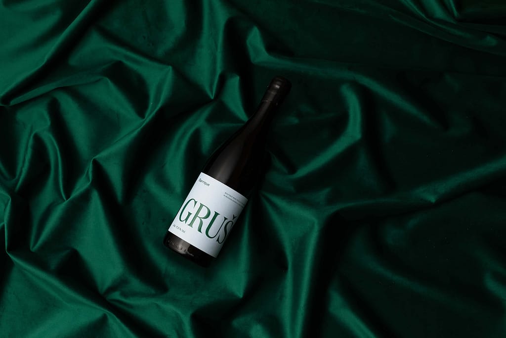
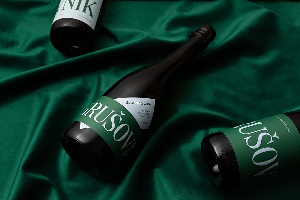
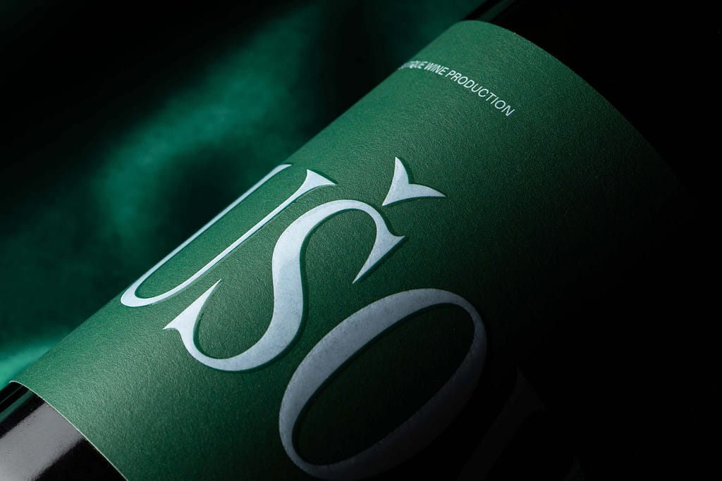
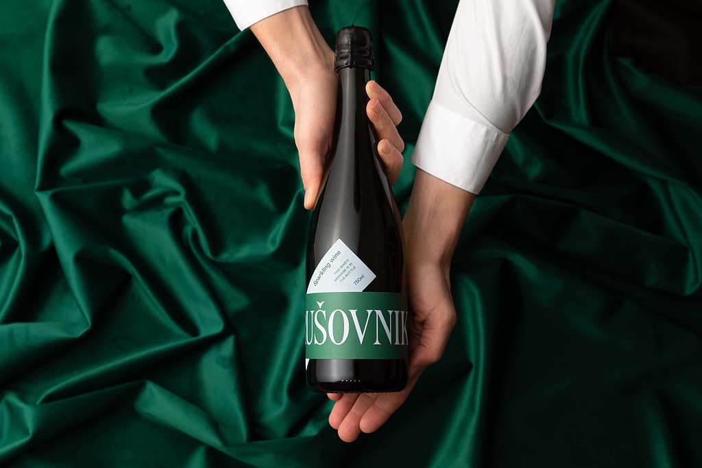
This is a small-scale producer still breaking into the market, so we were looking for a fresh approach that would boost their visibility and improve brand recognition. Their Barik label contains the fairly long brand name in large letters, so the full name can only be read by rotating the bottle. This turns the winemaker’s name into the central image on the label. Other information on the label is arranged nontraditionally, creating a dynamic end result. The wider bottle used for the sparkling wine allowed us to design a label of nontraditional dimensions. We expanded the core layout of the Barik label with additional text. This element makes it easy to distinguish between the two series. The color palette is green and light blue, which looks fresh and modern, and is at the same time not too invasive due to the subdued tones. We finished the label with a UV varnish for additional premium effect.